Responsive Design for InsureMyTrip
One of the must-have requirements of the website redesign project for InsureMyTrip was to make the website work well on tablets and phones. Our traffic from mobile devices was around 15% and rising quickly. We used responsive web design to meet this demand and selected the Bootstrap framework. Hristo Kanchev, a lead designer on the project, contributed greatly to our responsive design efforts.
We gathered mobile devices for on-the-fly testing but also used third-party services to ensure testing across a full-range of mobile platforms and manufacturers. We also built conversion funnels in Google Analytics specifically for tablets and phones. And we tested site performance on mobile devices. After all, performance is the first experience in any user experience.
Looking at our current mobile device statistics, we decided on two breakpoints for responsive design, one for tablets and one for phones. Additional design considerations included mobile design best practices such as ensuring that page elements stacked usefully on smaller screens and eliminating elements such as large-sized images that might hinder performance on cellular networks. We started planning a different quote and buy process for phones, but realized quickly we would not be able to get that done during the project timeline.
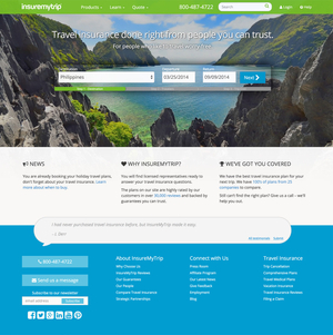
Here is the new homepage on a desktop screen:
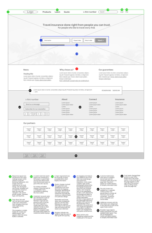
Here is the wireframe for the homepage:
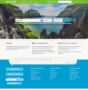
Here is the view on tablets:
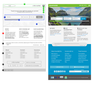
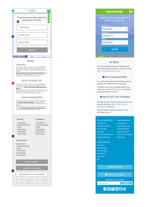
Here is the view on phone screens: