Mobile-First Insurance Quotes
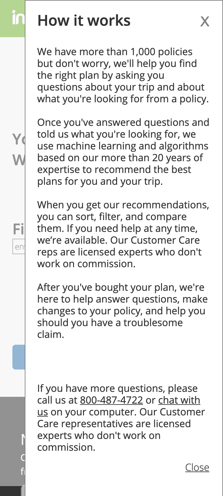
The first large project I took on since returning to InsureMyTrip was to rethink the quoting process of our website. The product manager and I had several sessions talking with customers, in group sessions and individual usability testing, and one thing that stuck out was that they did not trust our recommendations for insurance plans. As one customer put it, "How can you recommend something for me when you know so little about me?"
We met also with our Customer Care reps and listened in on many phone calls with customers. It was clear that the their sales process was more conversational, and they asked more questions than the website did.
We set some objectives:
- Get users to trust our recommendations.
- Create a more conversational experience that felt more human than typical insurance transactions.
- Simplify the process wherever possible.
- Create an architecture that would empower us to a/b test any element on any screen.
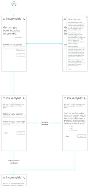
I mapped out a new user flow, working closely with our Customer Care reps and our insurance analysts. I created a user flow diagram that I updated throughout the project:

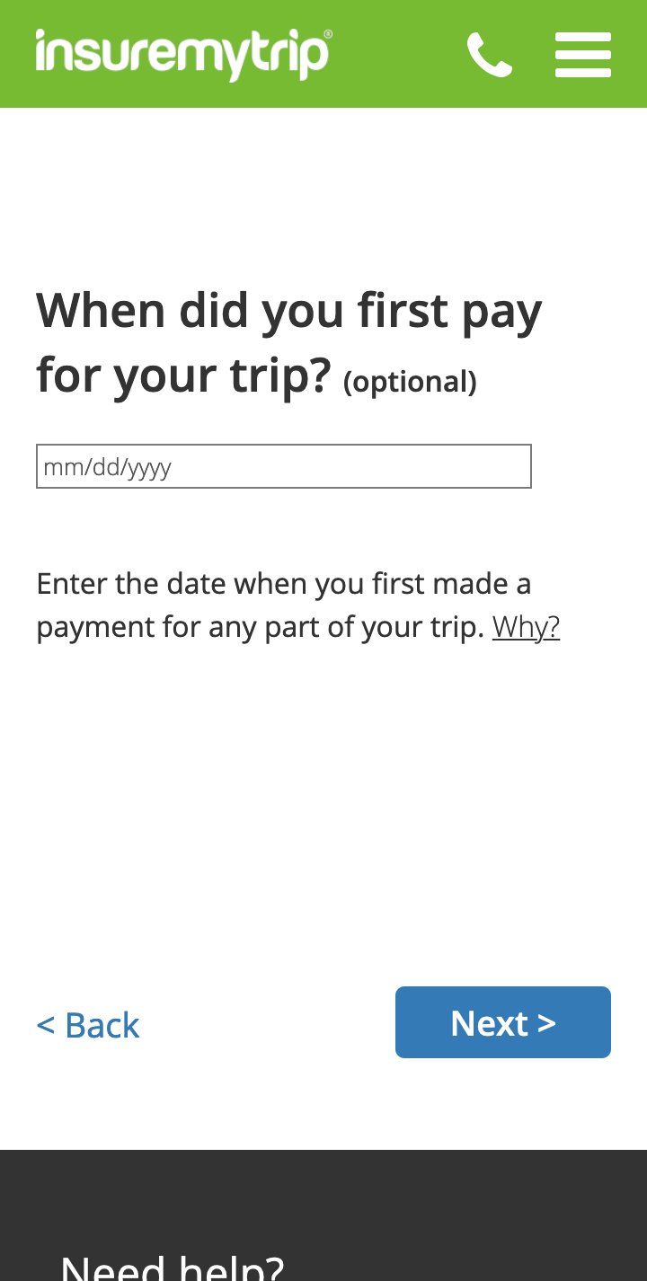
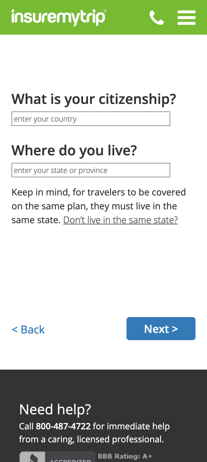
We followed LukeW's mobile-first design methods for this project, because our mobile traffic share is exploding, so we want to make sure we get it right on mobile and not just downsize a laptop experience. Second, by designing for the smaller screen first, we have to jettison what's unnecessary, which will help us keep the experience simple across all devices.
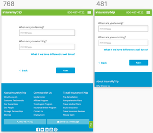
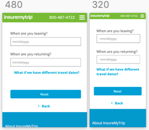
Here are a few screens from the mobile designs:
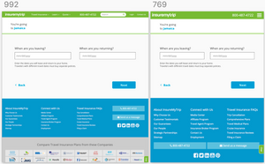
Alyson Desmarais has been taking each mobile-first screen and designing it across the breakpoints: